Wednesday, 29 February 2012
Diary entry 16: music video completed
Sophie and I spent the whole day finishing and perfecting our final official music video. We have finally finished!! YAAYYYY!!!
Saturday, 25 February 2012
Animation research
As i was researching various animations i came across this music video by Peter Gabriel- Sledgehammer. This music video was made in 1986 and was very good animation for its time. I think this is a very interesting music video and good because they use stop frame animation.
Thursday, 23 February 2012
Diary entry 15: Altering colourisation
In our media lesson my partner and I began working on and successfully finished altering the colourisation of some of our shots in our official music video. We have done this because later in the narrative shots the colour is more grey and barely any sun, where as in the opening narrative shots the sun is shining. Given this situation, we decided to alter the colour in the opening scenes in order for it to match the other narrative shots and therefore making it look more realistic. We also decided to keep the colour bright in the performance shots to show that there is a significant difference between the narrative shots and performance shots. Now that we have finished this all we have to do now is add the titles and some animations.
Friday, 10 February 2012
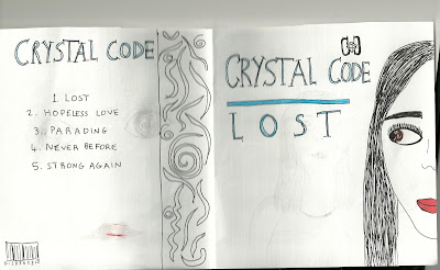
Evaluating own album artwork
From researching on Google CD art work, I noticed that most CD covers have extreme close ups of the artists face, long shots of a particular setting or unusual artwork. Out of this selection I thought it would be best to use an extreme close up of the artists face looking towards the title. This album cover is bold and memorable which helps the audience to connect with the artist and are therefore more likely to purchase the album.
Examples of this:
For the inner casing I thought it would be best to have another picture of the artist with accessories. In this picture the artist is holding a small clutch bag and is wearing lace gloves. The clutch bag is covering half of her face which is quite intriguing and mysterious. The artist is also wearing the same costume and makeup as in the front cover which makes it matching throughout the CD.
At the back of the CD it consists of the name of the band, names of songs, bar code and a decoration on the side. I wanted to stick with the theme and keep the colours matching, so i just used black, white and silver. As I was researching digipacks I noticed that the back doesn't usually have images and usually inst very crowded. For this reason I didn't add pictures and left the writing simple but also added a border on the right hand side so it doesn't look plain.
Tuesday, 7 February 2012
Diary entry 14: Transfer to final cut
Today we have completed the editing of cutting the music to the beat of the song. We've also added more performance shots to the video in order for the audience to feel closer with the character and to add diversity. We've transferred it to final cut pro and next we are going to alter the colour of some of the shots then add titles and transitions.
Subscribe to:
Comments (Atom)


